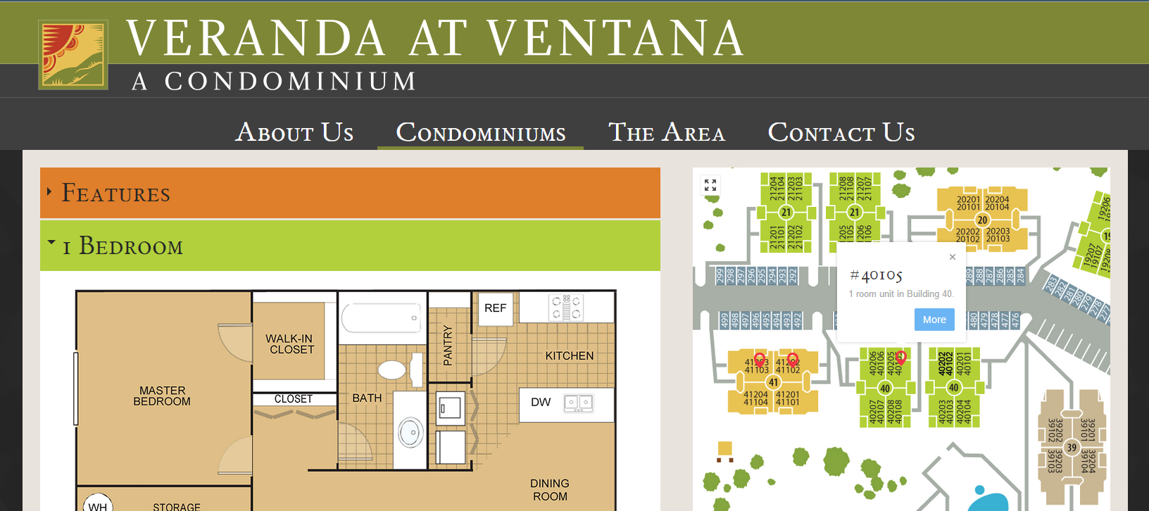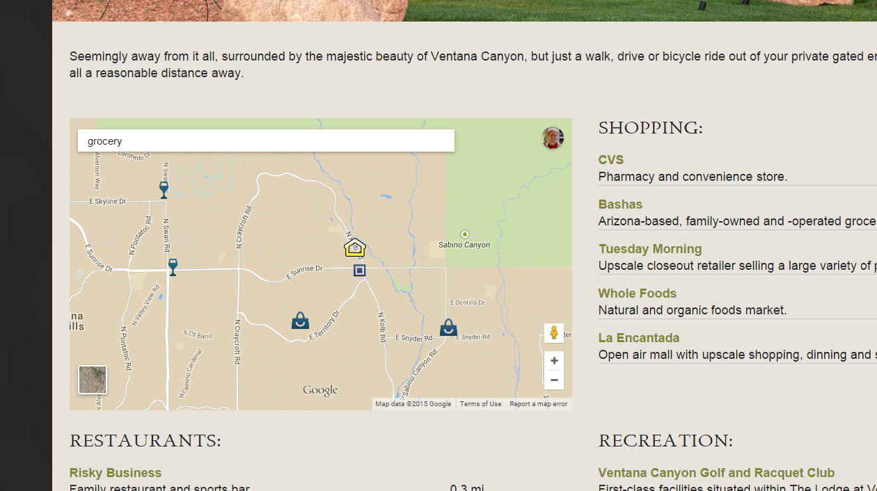
Veranda at Ventana is a condominium community near the Catalina Mountains in Tucson, Arizona, for whom I’ve just completed designing and building a website. Due to my study abroad plans I had decided to stop accepting work in January; however when I was contacted about possibly working on this project something convinced me to go against that decision and give it a go. Boy, am I glad I did! Not only were Bill and Malea great to work with, but it was also a fantastic learning opportunity.
While I’ve dabbled with responsive design and various interactive elements on things I’ve created for fun, this was finally a chance to put it all together in a complete production. Read on if you are interested in reading more about my experience with this project.
Photos
One thing about Tucson (and its mountains) is that it is incredibly photogenic. Especially at sunset and sunrise. Their photographer, Mike Leland, gave us some amazing photos to work with and I really wanted to showcase them. While just putting a nice slideshow on the landing page could do that, it really didn’t do the photos justice. Instead, I went for a more bold approach: using the page background to show off the photos complete with a parallax effect!
The only issue here is that most browsers don’t have smooth scrolling like Firefox, so some of the parallax effect is lost. A simple fix to at least improve the parallax effect in other browsers is to define a maximum jump in movement and perform an animation to fill in the rest of that gap.
Interactivity
Despite the overall structure for the website being pretty compact and straightforward, there was still a lot of information to fit into the website. The key to sticking it all together was to have all of the information on the page but not immediately visible. Combining some tools from jQuery UI for the organization and the Mapplic helped organize the information into collapsible subsections, allowing it to be accessed quickly without overwhelming a visitor with a massive page of information.
Maps
Considering that this website centers around a very particular location, it made sense to represent a lot of the information with maps. On this site we have two different types of maps. The first is the one used to display the available condominiums, and the second was to show the community relative to the surrounding area. Working with a custom map of the community, I was able to map out all of the unit locations using the Mapplic jQuery plugin and a custom PHP script for outputting the JSON file required by the script. The PHP script was key in developing the two different views for this map: 1) All available units, read from the database created by the CMS and 2) displaying a specific unit when creating a listing in the admin panel.
The map of the surrounding area is based on Google Maps and a custom script that allows searching for nearby places and using a custom markers to represent the community location compared to the location of the search results.
Responsive Design
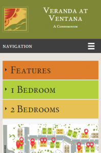 The site also needed to be useful beyond visitors trying to do research on a place to live. It needed to also facilitate quick information someone might need, like quickly finding the address while on your way to a showing. Of course, this brings in the need for a mobile capable design as well. The key to getting the site scaled down was to be working with a responsive mindset the whole way through. The development of a single component was not complete until it scaled nicely from mobile to large desktop.
Content Management
From the beginning, the clients were clear that they’d be wanting a way to update some of the content themselves without having to wait for someone else (i.e. me) to do it. For this reason it was vital to base the website on a content management system. While it would have certainly been possible to build a custom one for this instance, it made sense in the interest of time to find and use an existing system for this. Using the Realcon system as a base, I was able to customize it to fit the types of property information we needed to display on the website, and even integrated the same Mapplic system into the admin panel for previewing property locations. In the end everything went together well. I’ll be honest, though, the code for Realcon was not particularly easy to work with, but the modifications still probably took less time than building a whole new system.
Optimizations
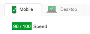 When testing out the website, one of the major issues I noticed was that the site seemed to load rather slowly. It is likely that my distance here in Brisbane from the servers in the US is responsible for part of that, but it was still a major focus of mine to speed up the site either way. Using Google’s Page Speed Insights tool, I was able to get the first render time down to under a second, even across the Pacific from the servers on which the site is hosted. The Smashing Magazine’s article on improving their own website’s performance was a huge help, especially with improving the CSS delivery.
